WordPress Theme Made
For Freelancers
You can trust us. We will double your hourly rate.
Best Rated Theme of All Time
No.1 out of 9,000+ themes

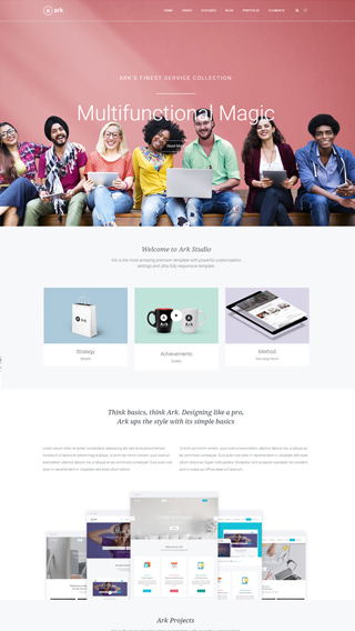
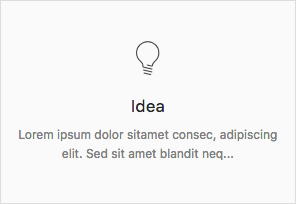
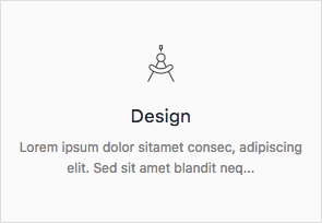
What can you create with The Ark?
Finally, there is no limit to what you can create, below are just a few examples.
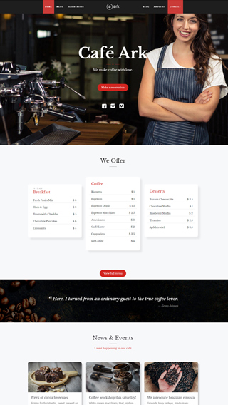
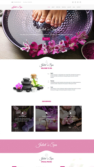
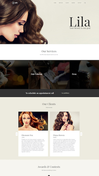
Small business websites
Create stunning websites for your clients or your business
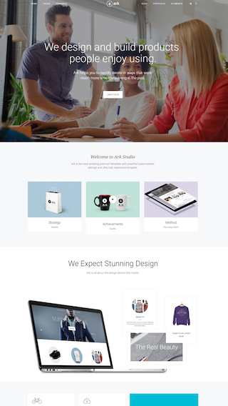
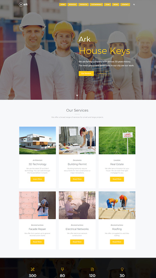
Corporate websites
Produce prestige, clean and good looking website for corporations
Authority Blogs
Grow your audience with our premium blogging system
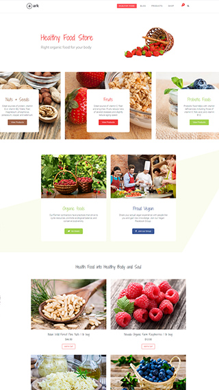
Ecommerce shops
Create sites which sells goods online
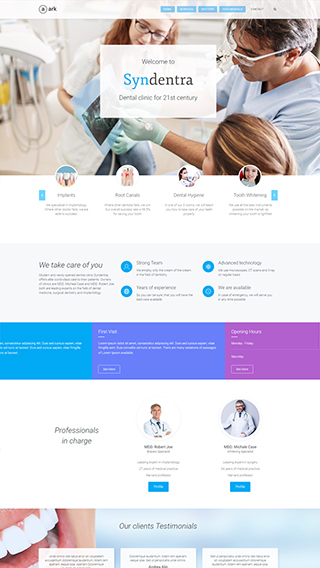
Secure membership portals
Protect your content in secure membership portals
Landing Pages
Create high converting pages
Sales & Marketing pages
Create full scale marketing sites and sales pages
Mobile Ready versions of all pages
All your pages will be mobile automatically


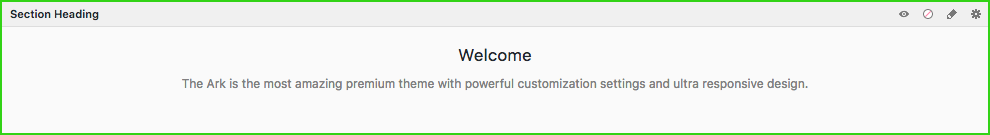
The Ark
Academy
A complete, 8+ hours long, video course. Divided into 117 standalone lessons.
Covers every aspect of working with Ark. Made directly by the Ark team.
Hire Us
Get access to the agency behind Ark Theme and hire WordPress Developer

Website Development
We can create any kind of website, powered with the Ark theme.

Custom CSS, PHP and JS
After 10 years in WordPress development, we can code anything.

Cooperation with Agencies
PSD to WordPress - we are world class players in this discipline


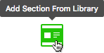
250+ Section Blocks Library
Insert 5 of them and page is finished
Pick few of the 250+ predefined sections, put them together and tadaa, your website is done in literally 2 minutes. Template Section Blocks are build from basic elements, so you still have the full control.
No coding required!
You can change everything without writing a single line of code
In this example we are modifying one of the 220+ builder elements. On average, every element has 1500+ customisable options. Changes are done exclusively using the tools available inside that single element. No coding knowledge required.
Before
After
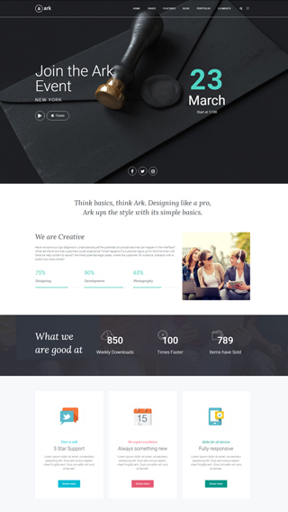
Success Stories

Denise Marques Leitão
Purchased 2 licenses so far
“Ark is so intuitive! I love it!”
I'm not a super tech-savvy person; I'm a writer! And yet I was able to make a small business website pretty fast. I tried another theme (because I already had a license) for my personal page but I could not use it. It seemed so clunky and hard to use compared to the Ark. Ark is so intuitive! I love it! So I happily bought another Ark license and built my website in 2 days.

Thomas Vychodil
Purchased 8 licenses so far
“2 marketing sites in 1 day.”
In the past, I have usually been using one of the dinosaur themes such as Avada and X. But they really started to show their age since they are from 2013. With Ark I have finally found a perfect and modern WordPress theme. The team behind the Ark has created a multi-use masterpiece. I was able to create 2 marketing sites in 1 day and am genuinely having fun creating my pages now.
Video Testimonials
We have reached out to our amazing Ark community and asked them to record short video testimonials for you. Each person has their own story and reasons for choosing Ark as their preferred tool for making websites on WordPress.

Built by leaders in the WordPress industry
1mil sales
100k users
3 awards
Made for performance
Every aspect of Ark was carefully optimized to produce the fastest website possible. There are a lot of caching and development optimizations under the hood that you will not find anywhere else. Unlike all the other multipurpose themes, Ark is not bloated.
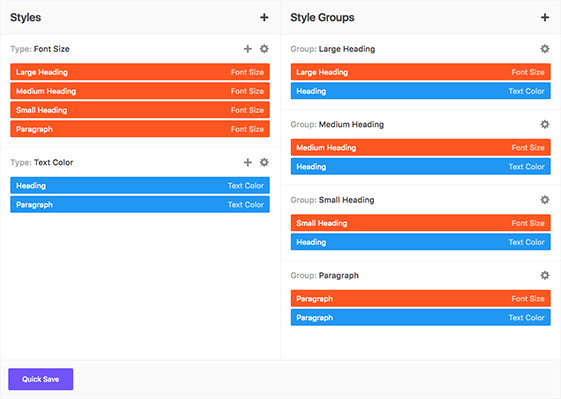
Global Styles
NEW! You now have the ability to control every little styling detail on your website from one central location, in any way you want.
Watch the Global Styles tutorial
Bootstrap Responsive Grid
Ark contains dedicated Bootstrap elements that you can infinitely nest in Fresh Builder. No other theme will allow you this level of control. You can pull, push, offset, overlap, and more.
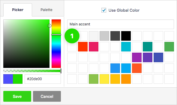
Global Color Library
Each color slot works like a global variable. Change a color in one place and it will change everywhere on your website.

Background Layers Editor
Get creative with unlimited number of background layers, in any order.
1 Image Layer
2 Video Layer
3 Slant Layer
4 Parallax Layer
5 Color Layer
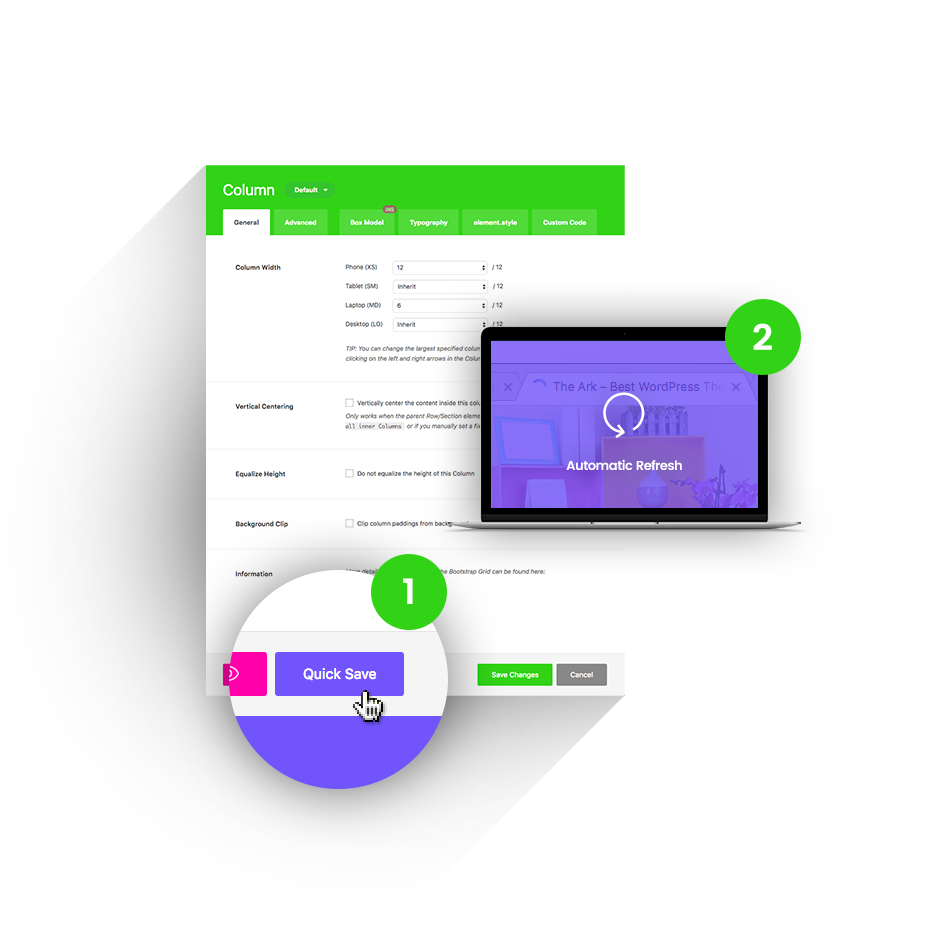
Quick Save
Other themes will reload their admin screens under your hands, making you wait up to 20 seconds to continue working. Ark will instantly save in the background (AJAX) and even update the front-end of your website.
1 Press the Quick Save button.
2 Changes refresh automatically.
Features
Everything you would expect from a top premium theme and then some.
SEO optimized
We consulted leading SEO and marketing specialists when writing our code, so you wont have to
Speed Performance
We carefully optimised Ark. GTMetrix 94, Pingdom 99 scores.
Responsive
You can set anything for every breakpoint. Including font size, text align, etc.
Multilanguage
Fully supports WPML (except for their premium automatic translations system) for making multilanguage versions of your websites.
WooCommerce
Perfect integration, great for making shopping sites
5 star support
Best rated support across whole ThemeForest
Header builder
Make any header you want to
Lifetime Updates
We iterate on weekly cycles. Also we listen to our user's suggestions.
Child Theme
Ark is delivered with Child Theme for your better comfort
Social Media Options
Enhance your website with social media options
Unlimited Sidebars
You can insert them in footer or content. Layout with 2 sidebars comes out of the box.
1 click demo import
Choose your demo, click "import" and tadaa, done.
Unique Features
Ark is always ahead. So far we have introduced 30+ unique features. For the first time in the world and exclusive to Ark.
Icon Fonts
Ark is delivered with 4000+ icons. We have fulltext search and you can upload your own icons.
Sitemap
You can customize every part of your website. For example assign different header and footer just for your blog single page.
Global Color Library
50 slots for saving colors, works like "variables". You change the color once, globally, change appears everywhere.
Keyboard Shortcuts
All accessible with 1 hand. Copy, paste, duplicate, remove, disable, enable, save, edit.
Background Layers
You can layer up different background types. Insert color, then parallax image and finish up with background activated only on hover
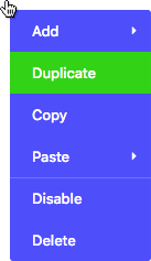
Context Menu
Right-click everywhere, just like on the desktop. Makes super-fast workflow.
220+ Builder Elements
Every element has 1500+ customization options on average. First time in history, only sky is the limit.
Dark/Light text color
Every element has CSS styles for dark / light text color. Change them with just 1 click, set advanced inheritance if needed.
Quick Save
Hit this button, your builder is saved trough AJAX and front-end is automatically refreshed in same time. No waiting! Available everywhere!
Match Height
Match height of your columns just by one-click. Can be set for every breakpoint.
Advanced Image Options
Every image can be resized, set it's quality, aspect-ratio, make it fullwidth, prevent being larger than container. Also alt and title attributes can be set easily.
Vertical Centering
Vertical centering of content is basically a taboo in CSS. We changed it! Enabled by one-click. Can be set for every breakpoint.
Fullscreen Sections
Set the height of your section as a 100% of window height and deduct -90px for your navigation menu.
Form Builder
Create amazing forms, style them, customize them and even hook the sending actions with your analytics
Visibility
Every element or it's part have 4 checkboxes. You can hide / show them for every breakpoint.
Slider Builder
Create slider, insert slides. Fill them with Fresh Builder Elements. Set autosliding. Choose between 3 slider types.
Clever Buttons
More than 10 basic variations, can be customised up to 1000+. 2 buttons in 1 row can be done pretty easily
Smart Links
Every single image has these settings, pictured on the right image
Custom Post Types
Ark plays with custom post types like a charm. No coding skills required, everything can be done in Fresh Builder
Builder in Builder
Customize every part of your element. Reorder it's pieces with drag and drop interface.
Custom Container width
Adjust your site width in Theme Options. Can be set for every breakpoint.
Loop Builder
Customize loop, post content, featured image, post meta and more. Drag and drop them to your wish. First time in history
System Tabs
Every element or it's part have 4 customizations tabs. Box Model, Typography, Element.Style and Custom Code
Complete Bootstrap
All the col, row, push, pull, offsetting and much more! Infinite nesting introduced for first time!
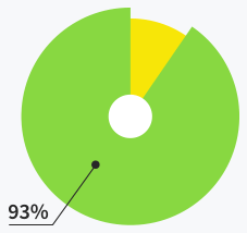
Support
Average response time is : 14 hours and 32 minutes
Users do not need
support at all
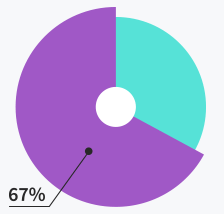
Users are satisfied with support
quality and response time
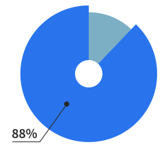
Tickets solved within
first response
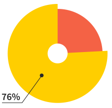
Meet our community
Ark is their #1 theme
Of our users are making
websites for living
Of our users will make more
than 7 websites this year
Happy members
17,000+
Extra Value

$25*

$20*

$20*

$24*

$24*

$42*
$155*
*This is price for which are plugins sold separately
Included in the Ark for FREE
Ark loves integrations
Our system works perfectly with all these tools and platforms
WooCommerce
WPML
MailChimp
Advanced Custom Fields Pro (ACF)
Revolution Slider
WP Super Cache
Jetpack
Yoast SEO
Membership Pro
Ultimate Membership
Restrict Content Pro
Google Analytics
Contact Form 7
Layer Slider
Custom Post Types
Facebook Comments
Essential Grid
Coming Soon plugins
NextGen Gallery
CPT UI
and many more ...
Detailed documentation
Plus many helpful videos with English voiceover
Ark Introduction
Buttons
Icons
Portfolio
Visibility
Blogs
Titlebars
Headers
Sitemap
Vertical Centering
Smart Links
Slider Builder
Section Library
Right-Click menu
Quicksave
Keyboard Shortcuts
Form Builder
Dark / Light text color
Color Library
200+ elements
200+ elements
Image Options
Fullscreen Sections
Background Layers
The #1 Best Rated Topseller
See why we are #1 out of 9,500+ themes
4.97/5
"This theme is extremely flexible, and can fit just about any site you want to build."
 – Jaythekreator
"The best theme I have ever used. Years ahead of Avada, years ahead of Enfold."
– Billions"Ark theme is the one which I’ve been searching for for years!"
– Glowczynski"I haven't seen such an impressive theme for a long time... And I've seen many! What a gem!!!"
– WebScope"Ark is literally the best theme I've ever used and I've used more than a hundred premium themes."
– Meceware"Too painful to use any other theme now, after getting used to Ark."
– Khalid123456